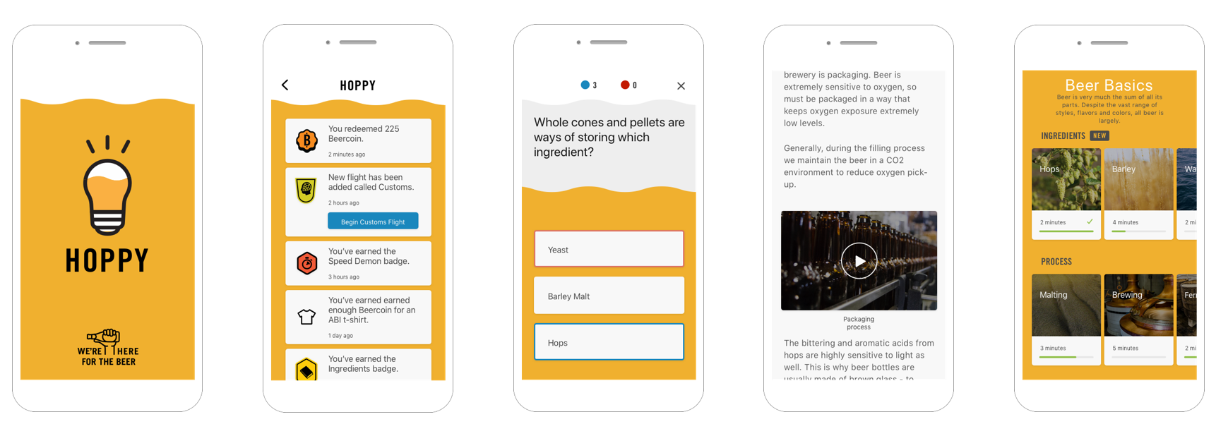
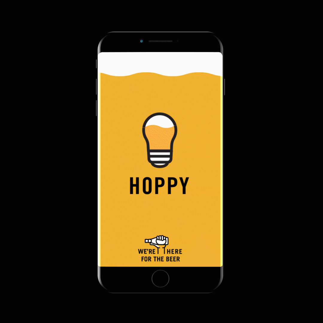
Hoppy
As the largest brewing company, ABI is crafting a new brewery culture by educating the public on the topic of beer.
After 6 months of hard work, we created a beer learning app, Hoppy, which provides a unique way to gather their employees around the world. I designed some features on the app, and the whole content management system (CMS) for editors from the US and Mexico will use to publish daily quiz and beer related content on Hoppy.
MY ROLE
-
UX Research of web data scraping and secondary research.
-
Product thinking by planing and running a workshop, and defining the problems along with cross-functional teams.
-
Product design
- Report and present the project outcome.
GOAL
ABI is the largest brewing company in the United States and employs over 30,000 people. We want to create an in-depth conversation on the topic of beer for their employees. By understanding beer culture, beer making process, ingredients..., people are truly able to enjoy every beer they sip.
UNDERSTAND USER NEEDS
Ideation and workshops
After several brainstorm sessions and workshops, we defined the user story and use some design methods to help us created more valuable customer experience.
In addition, by defined at most three business goals and available technologies, that we know our user story to achieve with KPIs.
Earn and learn daily
In the end we came out with this mobile app idea, Hoppy. Hoppy is a fun and engaging beer learning app. When user complete Daily Quizzes, they earn badges and Beer coins. User can use the beer coin to redeem the prizes. So, my task is to design a user-friendly CMS/ Backend for administrators from ABI, and to create and organize a 30-60-second learning game for daily use. At launch, we also included 110 multiple answer questions that are in both English and Spanish.
CMS DESIGN PROCESS
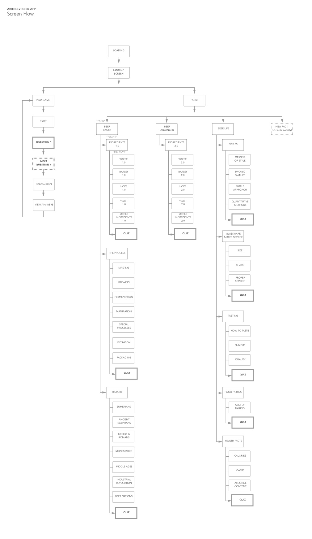
Creating the right user flow for this project was crucial. I used user flow to illustrate all the steps involved in how a user satisfies one specific task through the website or application.
Due to the nature of the app, we had multiple categories and subcategories for beer lessons. Each lesson had its own quiz sections. In addition, Daily Quiz was pulled from the quiz sections, and questions answered incorrectly would resurface with greater frequency for each user. I worked with our developer team closely at this stage, to make sure the user flow was logical. Our focus was to create an open and easy to use interface for our global users. (Administrators are from different regions)
1. App screen flow and rough wireframes to communicate with key stakeholders
2. Sketches to figure out the possible user flows
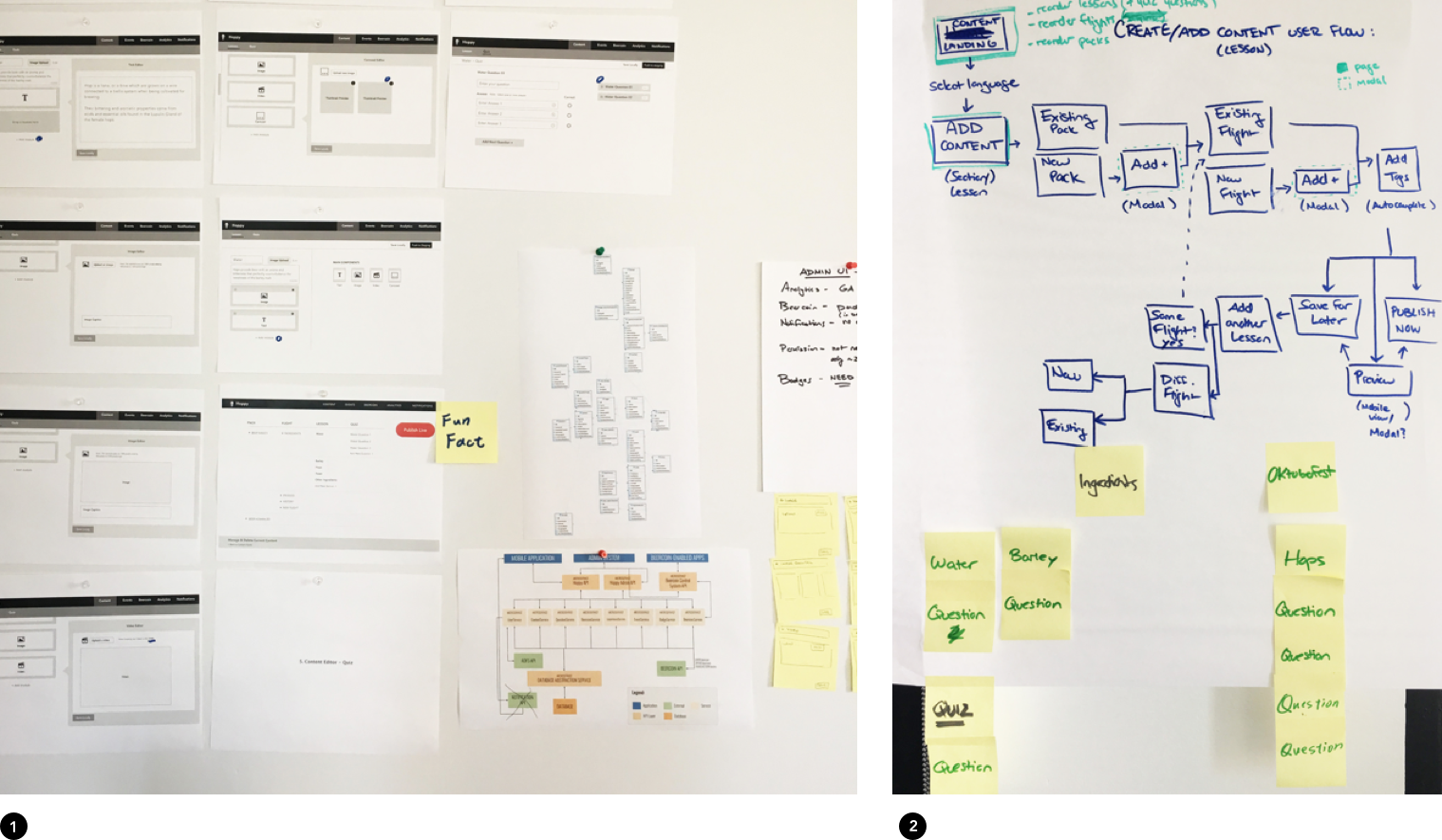
App Screen Flow
CMS Sitemap
“Designing the easiest and intuitive user interface by creating the right user flow”
DESIGN EXPLORATIONS
+ USER TESTING
Fewer clicks = better User Experience?
I worked with developers and stakeholders together on the content management concept, and went back and forth at the user flow.
Have the Hoppy CMS start from Content Editing page seem intuitive and easy, but most ABI editors are not familiar with the content architecture as much as we do.
After user testing with Deutsch internal team and ABI employees, I learned a beautiful content with wrong category tags will take developers and editors a lot of effort to fix after it was pushed and published.
![]()
Mapping user flows with wireframes
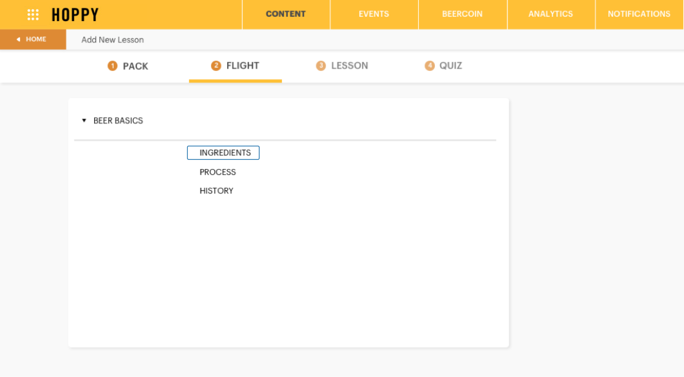
Our final solution is the user needs to select their task on the Content landing page. After user select from "Manage Current Content ", "Add New Lesson" or "Add New Quiz", then they select the category, following subcategory and then content editing page.
![]()
After user testing with Deutsch internal team and ABI employees, I learned a beautiful content with wrong category tags will take developers and editors a lot of effort to fix after it was pushed and published.
Mapping user flows with wireframes
Our final solution is the user needs to select their task on the Content landing page. After user select from "Manage Current Content ", "Add New Lesson" or "Add New Quiz", then they select the category, following subcategory and then content editing page.
POSSIBLE USER PATHS WITH WIREFRAMES
1. Manage & Delete & Edit current content
1. Choose the task - manage, delete and edit current content
2. Select categoty
3. Edit name
4. Delete confirmation page
5. Select sub-category
2. Select categoty
3. Edit name
4. Delete confirmation page
5. Select sub-category
6. Edit name
7. Pick a lesson
8. Edit / manage quiz
9. Confirm to update and publish page
7. Pick a lesson
8. Edit / manage quiz
9. Confirm to update and publish page
2. Add new lesson
1. Choose the task - Add new lesson
2. Select categoty
3. Select sub-category
2. Select categoty
3. Select sub-category
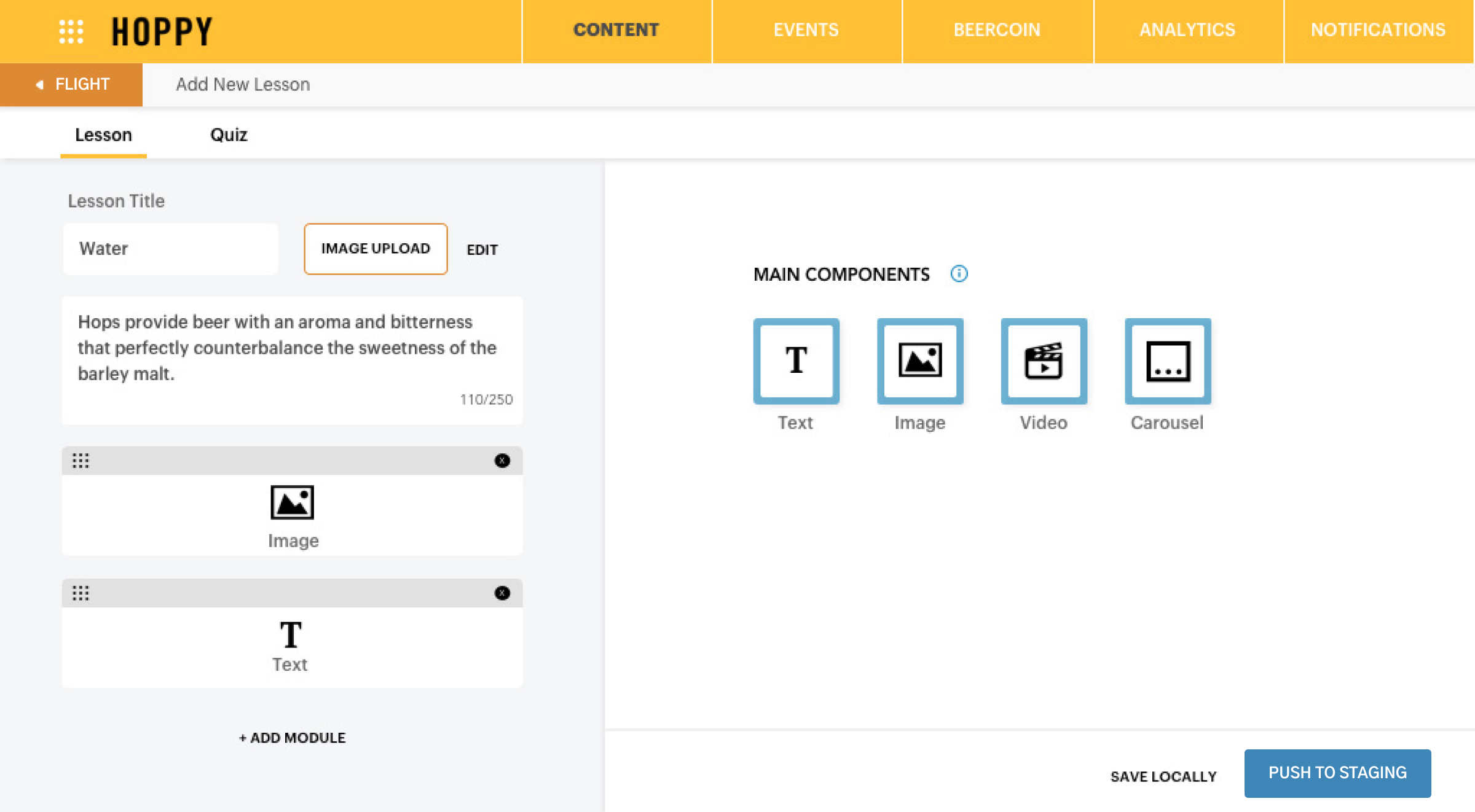
4. Content editing page for lesson
5. Confirm to update and publish page
5. Confirm to update and publish page
3. Add new quiz
1. Choose the task - Add new quiz
2. Select categoty
3. Select sub-category
2. Select categoty
3. Select sub-category
4. Select one or more lessons
5. Content editing page for quiz
6. Confirm to update and publish page
5. Content editing page for quiz
6. Confirm to update and publish page
DESIGN SYSTEM — UI DESIGN
Made the UI design for CMS, expand the design system from the style guide created by our designer to the platform
CMS landing page : Content
Tooltips and language selector
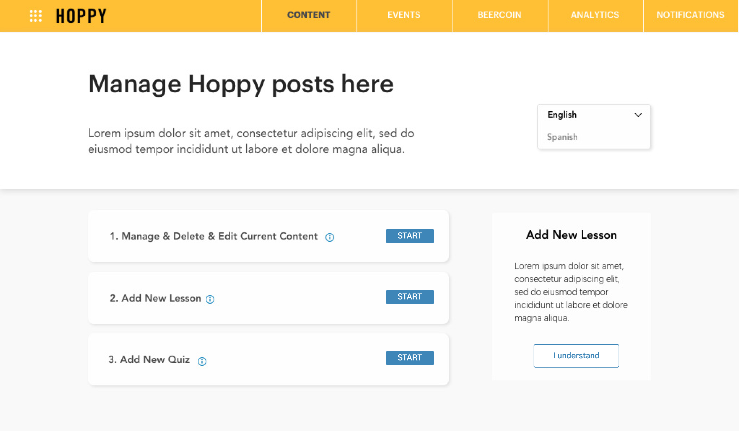
Category landing page
Content editing page
USER TESTING AND POST LAUNCH DESIGN RESEARCH
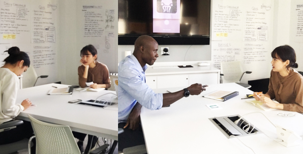
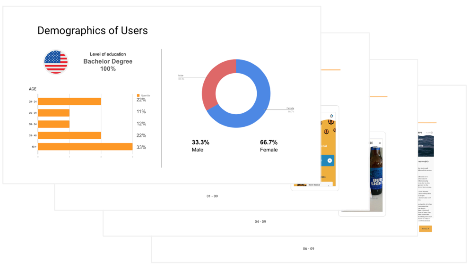
Before Hoppy was launched, I ran a user testing session, interviewed with nine users with The STAR method for Hoppy App. It was very fun and insightful. I analyzed the result and made a report.
![]()
Create effective data visualizations to communicate with stakeholders
![]()
After shared the User Testing result with the Hoppy team, we rated the severity of the problems and fixed the most critical ones. And we started to make a plan for phase 2.
_Download on the App Store ︎
Create effective data visualizations to communicate with stakeholders
After shared the User Testing result with the Hoppy team, we rated the severity of the problems and fixed the most critical ones. And we started to make a plan for phase 2.
_Download on the App Store ︎