Spotify Newsroom
As of Q1/2019, Spotify had 130 million subscribers worldwide. For this newsroom content design project, I collaborated with Spotify team on optimizing for easy social sharing and bringing high-res images and vidoes.
Used color, typography, grid, burst and beautiful imagery from Spotify design system to make it easy to drive a story and amplify the brand, Spotify: For the Record.
MY ROLE
User Experience Lead
UI design
Responsive web design
Interaction Design
UI design
Responsive web design
Interaction Design
THE CLIENT
Spotify is a music streaming platform developed by Swedish company Spotify Technology, headquartered in Stockholm, Sweden.
Spotify goes public on The New York Stock for April 3, 2018.
Spotify goes public on The New York Stock for April 3, 2018.
WEBSITE
DESIGN PROCESS
Before Spotify’s IPO in April, 2018, they wanted us to help build a deeper trust and relationship with customers by creating a newsroom website, “For the Record”. This is an open platform devoted to musicians, listeners and Spotify investors. We can use this site to share Spotify’s company news, music market trends, and company values.
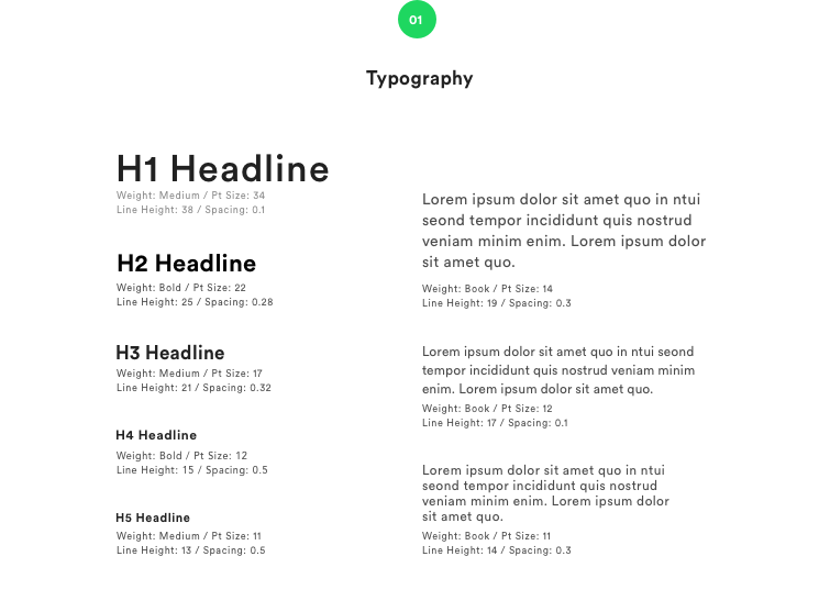
01_Typography
![]()
Chose the typography family from the Spotify style guidelines. The readability in typography is important, good typography makes the experience of reading pleasant.
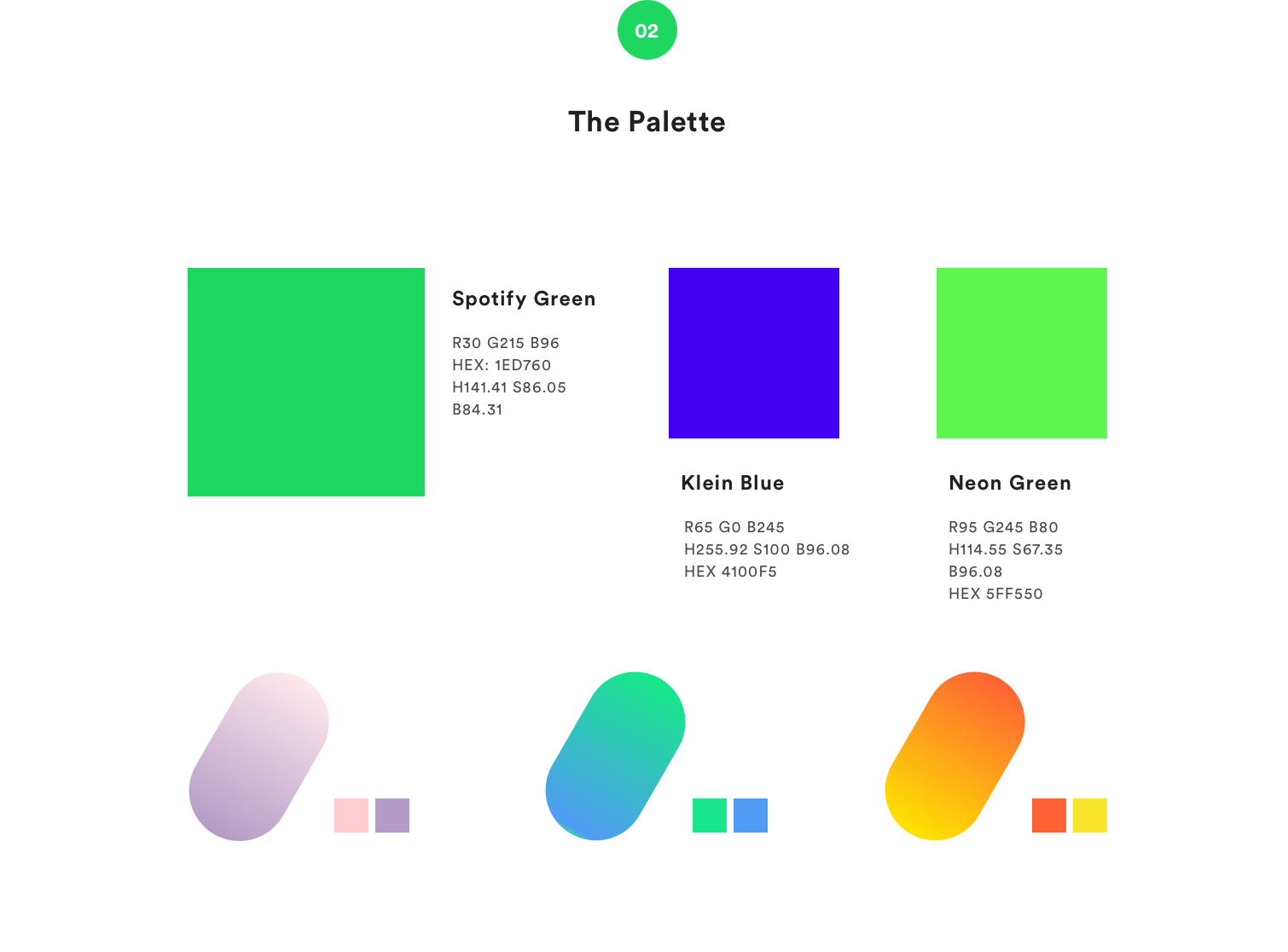
02_Color Palette
The color on For the Record supposed to be in line with Spofity style guide but also has its own visual identity. In this phase, use design system for consistency between products.
![]()
The color on For the Record supposed to be in line with Spofity style guide but also has its own visual identity. In this phase, use design system for consistency between products.
↳
USE DESIGN SYSTEM03_Interaction Design
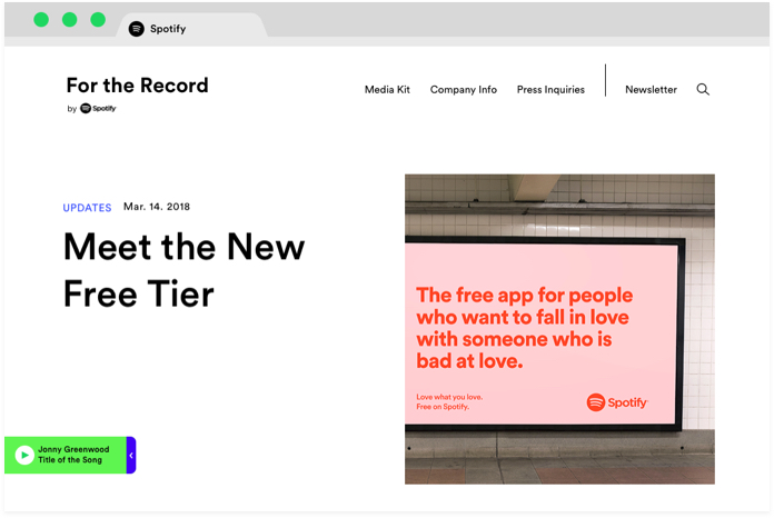
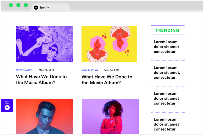
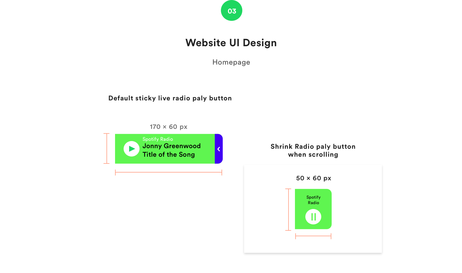
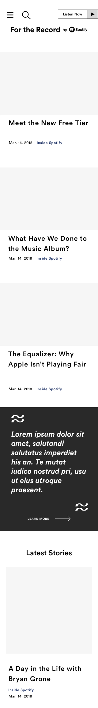
Homepage
After studied Spotify’s design system. I started UX research and competitive analysis.
Then I came out with this idea - a " live radio play button" on the homepage.
Spotify is a music streaming company, have a play button on their site so spotify can use it to share music they play from the office with their site visitors. This idea fits their brand while makes the site personalized and more engaged.
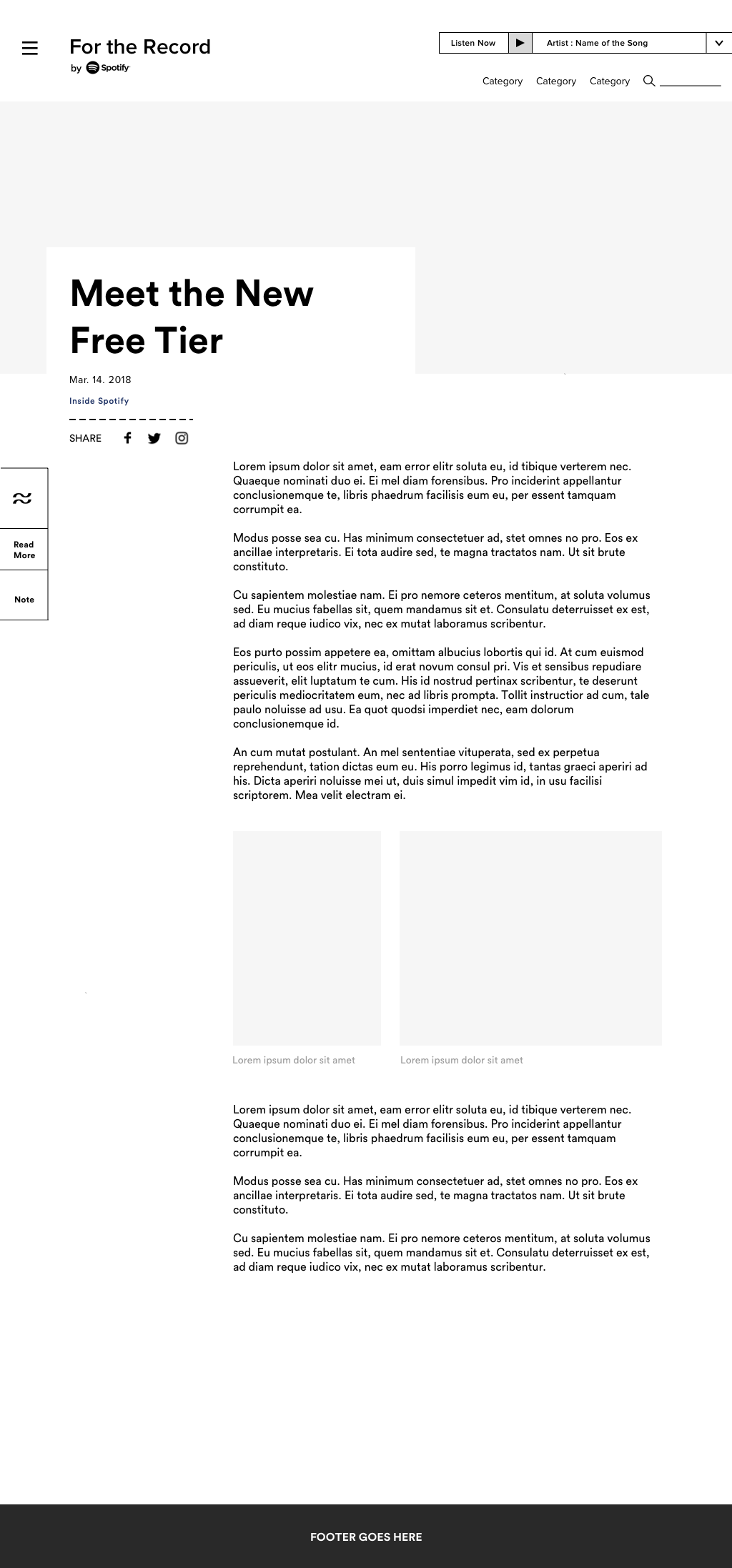
04_Website UI Design
Article Page
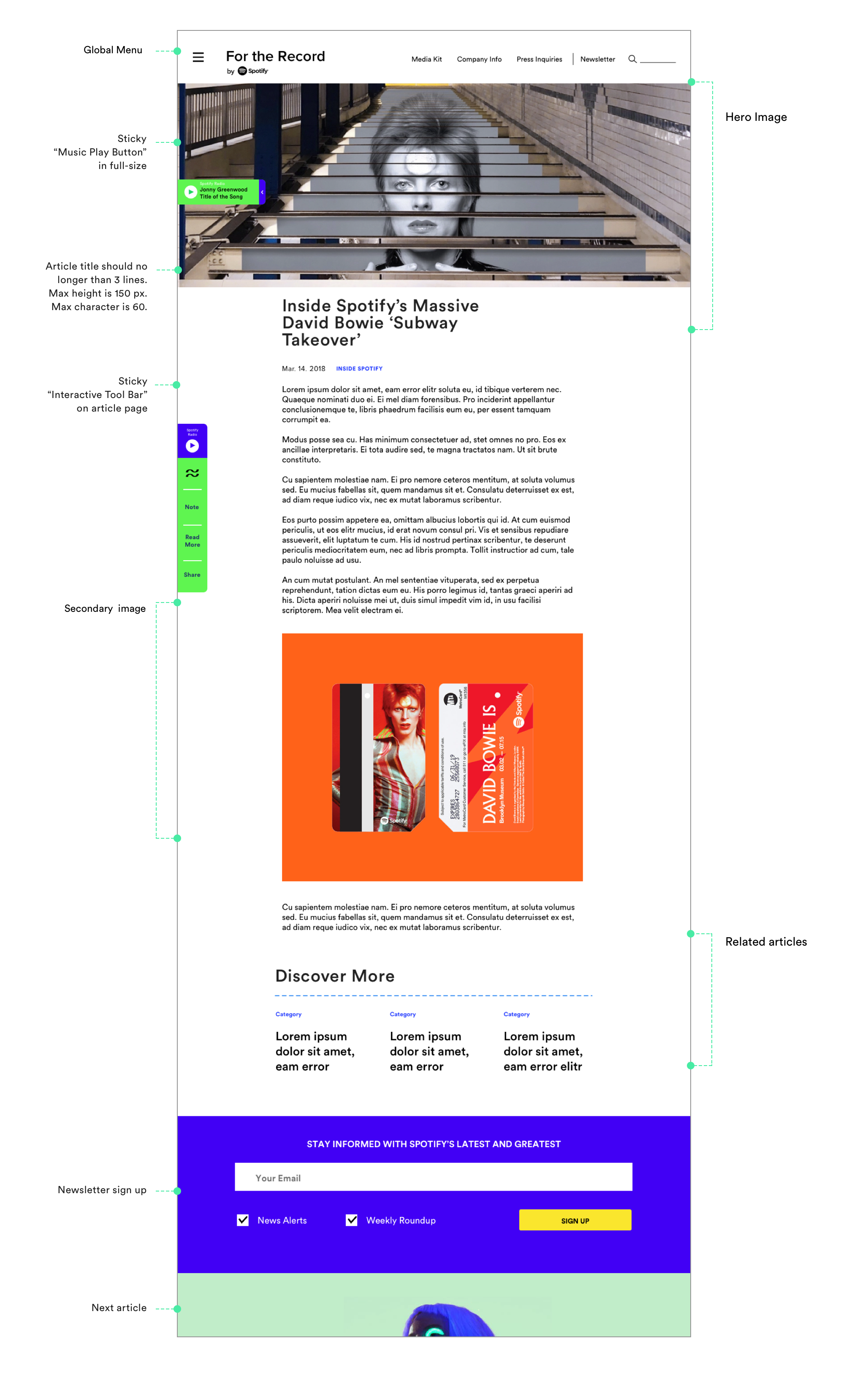
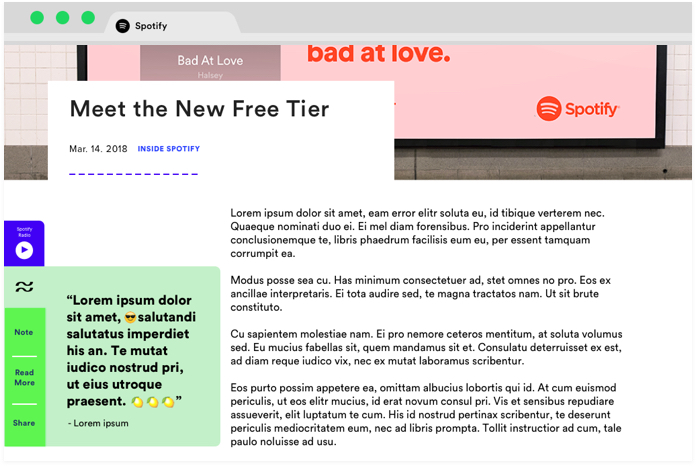
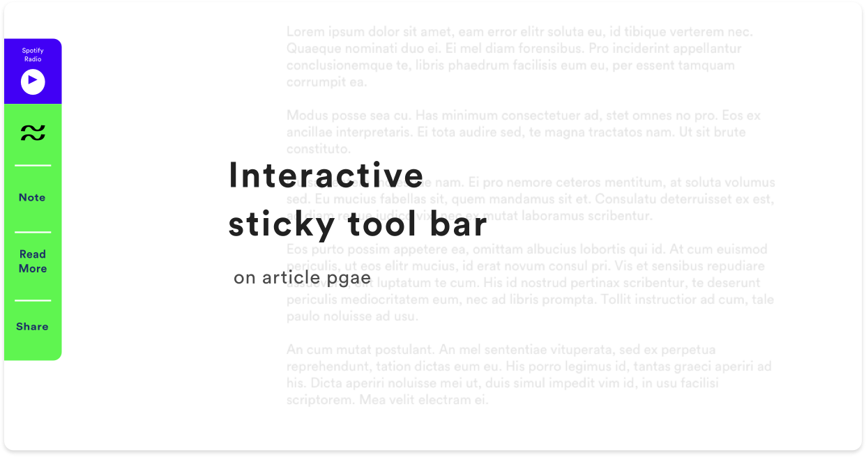
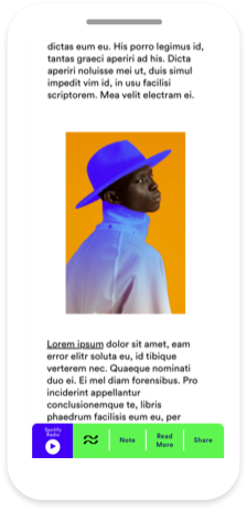
Continuing the “music play button” idea, this interactive sticky tool bar on article page was another feature I proposed. This tool bar follows the user when they scroll through the article page. User can click on the icons to expend the tool bar and explore the article. This also give the user an digestible overview of essential content in the article.
On the top of the tool bar, it has the "play button" from the homepage. And the next four icons are:
1. Highlight quote
2. Notes
3. Relate articles
4. Social share buttons
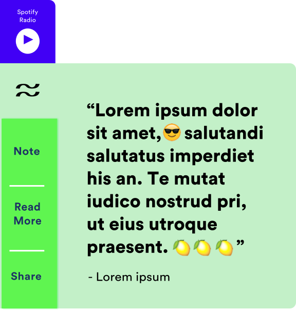
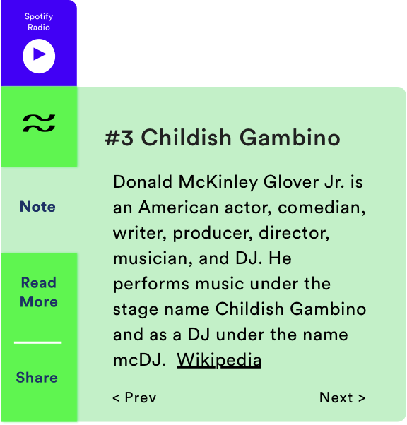
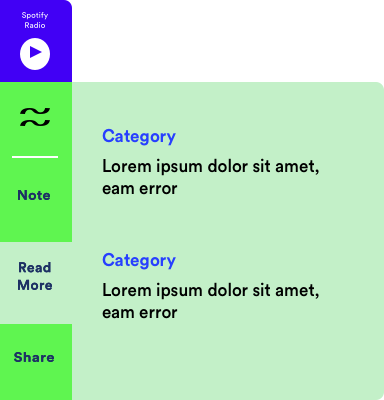
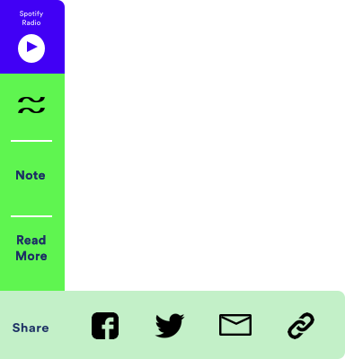
1. Highlight quote from the article
2. Notes made by editors or generate from wikipedia
3. Related articles for readers
4. List of social share buttons
Here is how the interactive sticky tool bar look like on desktop and mobile.
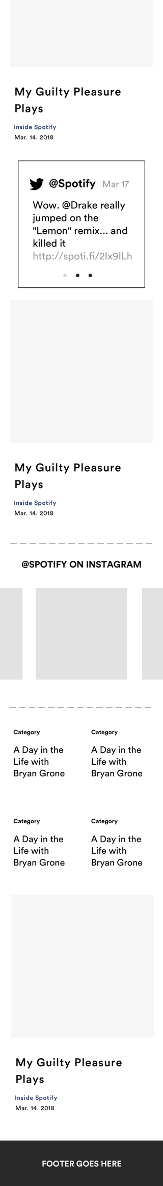
WIREFRAMES AND FINAL PRODUCT
Some wireframes from design process
↳
05_Homepage Design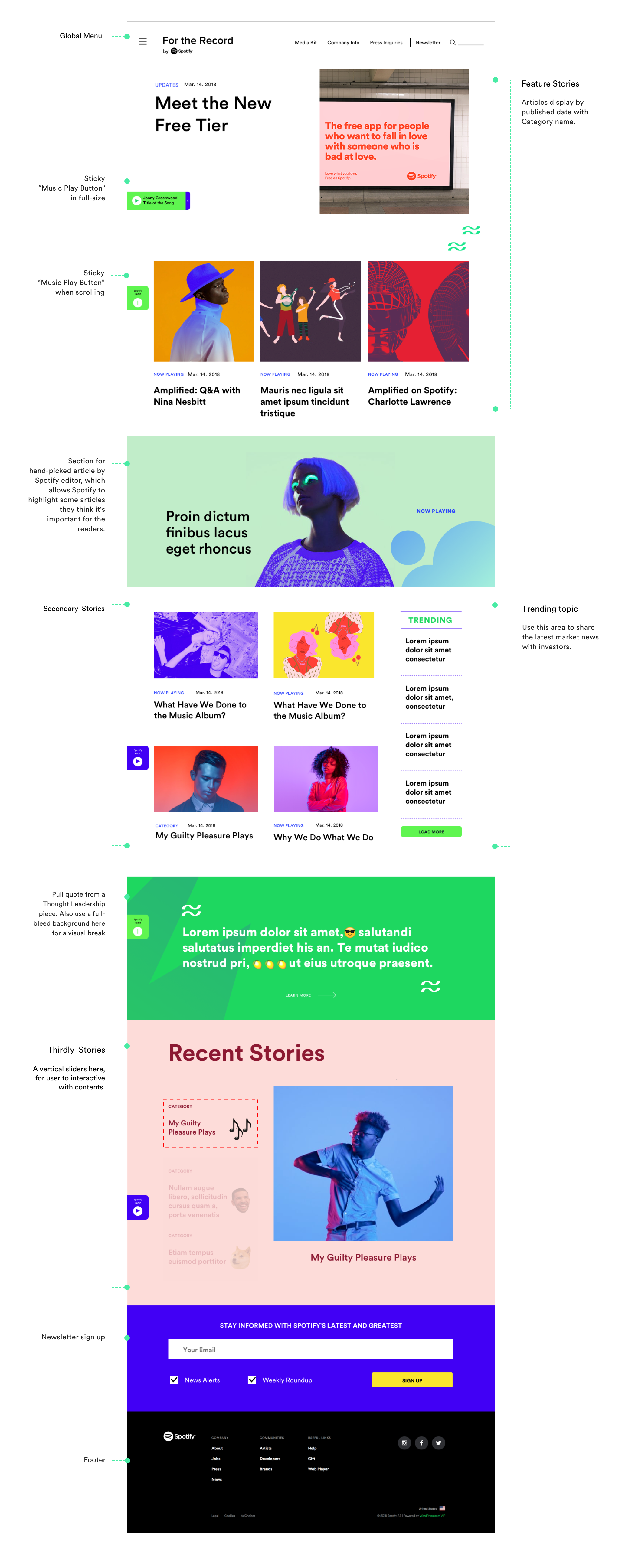
↳
06_Article Page Design